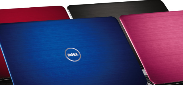
Inside Dell’s approach to the user experience of PCs, laptops and more
by Shane Schick — Jan 24 '14
by Shane Schick — Jan 24 '14

It was one of the companies that defined user experience in the early days of e-commerce, but over the last several years Dell has had to seriously rethink the way it approaches UX.
After a drawn-out fight with activist shareholder Carl Icahn and others, Dell managed to win a vote that allowed it to become a private company again. It’s a transition which intensified the spotlight at Dell World, its annual user conference that took place in Austin last month. There, several executives talked about how Dell was not only increasing its focus on how to better design its hardware, but the entire process by which customers choose, purchase and receive various products.
“One of the first things we did was de-segment the site,” said Bobbi Dangerfield, vice-president of Dell’s commercial sales operations. “Dell.com was built and defined more from a Dell internal perspective. What we’ve learned is that for a lot of customers, small and medium-sized business terms are simply ‘Dell-Speak.’”
Instead, today Dell.com is organized by simpler categories based on how customers are likely to use their products, such as “for work,” or “for home.”
Those design changes were only part of the process, however. Dangerfield said equally important was a major retooling of the training provided to its sales force. Almost a year ago, Dell introduced what it calls Sales Academy, which takes its more than 6,000 sales staff through a competency assessment that evaluates not only their knowledge of technology but consultative sales skills and relationship-building skills. This was complemented by other internal programs, like one called Help A Customer, which was designed to bring disparate employees closer together to deal with order and fulfillment issues, among other things.
“There’s nothing worse than a Dell employee going on an airplane and having someone hand them a business card, tell them about a problem and the employee not having a clue about how to get them help about it at Dell,” she said.
Big ears, but not big effort
Dell employees like to talk about the company having “big ears,” meaning it listens carefully to feedback, but what’s critical is proving that you’re doing something in response, said Doug Schmitt, Dell’s vice-president of customer support and deployment. For example, Dell has introduced a number of online troubleshooting tools that allow customers to self-diagnose what’s going wrong with their PC or laptop. The firm also has features that allow them to self-dispatch replacement parts rather than waiting on technicians. While those can be great capabilities, the UX needs to involve a minimum amount of time and energy.
“You can have customers happy with the experience but they still thought they put too much into it,” he said. “We need to reduce it.”
Dell has launched a new offering in the commercial space called Pro Support Plus, where large companies can see much more data about potential hardware and software problems. This means big customers can be more proactive and prevent issues before they arise, Schmitt said.
The UX behind the hardware
Of course, the ideal UX metric for Dell is having fewer buying or support problems in the first place, which is why Sam Burd, vice-president of the personal computing business at Dell, jokes that his team’s job is to put Dangerfield and Schmitt’s teams out of business.
“Ninety percent of customers will never have a hardware problem. The systems don’t break, they work for them,” he said. Overall, the company’s reliability is 20 percent better than Dell was five years ago, Burd claimed.
The UX rigour behind the design and testing of the hardware is key, Burd added. Even before the first sketches are made, Dell relies on a vast amount of first-hand observation and research about what can go wrong with a device once it’s in a customer’s hands.
“People tend to drop systems as they’re walking down the hall, holding a cup of coffee. That’s why the maximum shock absorption is needed,” he said, which is why he described Dell as the most extensive user of gorilla corning glass in the industry.
“When you scratch glass, that’s how you break glass. Gorilla is 10 times more scratch-resistant. There’s not the kind of fractures that will make it break.” He held a laptop by the top corner to demonstrate.
Dell then puts its hardware through the paces. Keys are one of the most extensively tested parts — Burd said keys on a laptop may be pressed more than 10 million times, and more than one million on a tablet’s touchpad.
As Dell continues to refine the various elements that have an impact on user experience, from design to the processes that get them into the market, being a private firm again will provide much more focus, Burd said.
“All the time we used to spend with Wall Street, that’s going back into customers and thinking about our business,” he said.
Shane Schick is the editor of CommerceLab. A writer, editor and speaker who helps people create value with information technology. Shane is also a technology columnist with Yahoo Canada, an editor-at-large with IT World Canada, the editor of Allstream’s expertIP online community and the editor of a U.S. magazine about mobile apps called FierceDeveloper. Shane regularly speaks to CIOs and IT managers at events across Canada about how they can contribute to organizational success, and comments on technology trends as a guest on CBC, BNN, CTV and other programs.
Twitter LinkedIn Google+
Apr 17 '14

Apr 16 '14

Apr 15 '14

Apr 11 '14
Copyright © 2014 CommerceLab


